The Moments of Truth
 Consumer packaged goods (CPG) companies are in a tight race for market share. Each second the consumer takes to decide on a purchase is another second a competitor could grab the attention of the shopper and be the one to be put in the grocery cart. Understanding how your product will stand up against your competitors, then, is key to ensuring your products will dominate on the store shelf (or online).
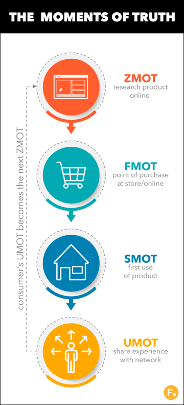
There are four main moments of truth that fast-moving consumer goods (FMCG) companies must be design their packaging for in order for consumers to form a favorable, lasting opinion of their product:
- The Zero Moment of Truth: The initial discovery phase in the buyer’s journey when consumers research a product, typically via a search engine, social media, e-commerce, and online review sites.
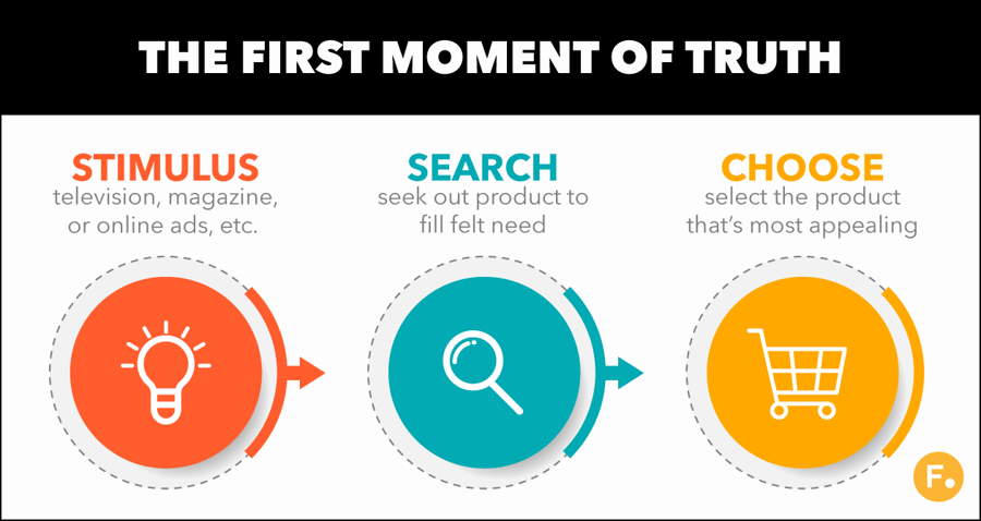
- The First Moment of Truth: The point in the buyer’s journey when the consumer sees the product, typically via advertising, searches the product out, and selects it either online or the grocer’s aisle.
- The Second Moment of Truth: The consumer first uses the product and forms an opinion about how it met (or didn’t meet) their expectations.
- The Ultimate Moment of Truth: The moment when the consumer decides to share their favorable (or unfavorable) opinion of your product. Many times, this becomes the next consumer's zero moment of truth.
In order to be notably superior in all moments of truth, you need to be able to design your packaging with each moment of truth in mind. Below we will discuss the moments of truth, the science behind them, and the best way you can design for them. Follow along!
Mastering the Zero Moment of Truth
|
Why is ZMOT important to today’s CPG business?
 According to Google, “88% of consumers research before they buy.” Google further estimates that consumers will consult an average of 10 online sources before committing to purchasing a new product. Typically, these resources are:
- Search engine results pages
- Social media sites (Twitter, Facebook, Instagram, Pinterest, etc)
- e-Commerce customer review pages
- Third-Party review sites
- Influencer blog posts
It may feel like you have little control over what a potential consumer will read on these sites. Keep in mind, though: They will not only be reading thoughts and opinions about your product, they will also be forming their own based, in part, on the imagery presented. That means for your owned channels (product social media accounts, official e-commerce pages, etc.), you have an opportunity to give the imagery the consumer needs to form a favorable attachment to your products.
What are you missing if you don’t design for ZMOT?
But how do you know what your CPG product will look like on Instagram, Amazon, Twitter, and more? If you don’t know what it will actually look like in the design phase, you won’t be able to plan for your consumers’ ZMOT experience. Take for example, this side-by-side comparison of a product rendering first, using CAD software and then 3D modeling software:
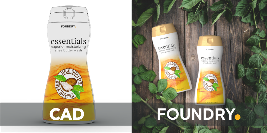
With CAD software (left), you get a sense of the product’s dimensions and overall appearance:
- Is the label properly placed?
- Is the cap proportional to the body?
- Is the overall structure of the packaging as design intended?
But look at what the 3D render tells you (right). Yes, it tells you everything the CAD render does, but it also informs you on:
- What will the design look like in likely marketing scenarios?
- How does the light play with the overall packaging design?
- How does light interact with the label design?
- Will this design be appealing in this scenario?
Many times, these questions can only be answered once physical prototypes are created and a photoshoot is conducted. But, design teams rarely have the bandwidth to set-up photoshoots just to see how a product will look in real- world and marketing conditions. On top of that, asking for, and receiving a physical prototype can take weeks. During that time, the project’s on hold.
But with 3D modeling and rendering software, not only will you be able to see these things in the design stage, you will be able to make changes, on-the-fly. This means you will be able to test your design in ZMOT conditions without the wait of a physical prototype. The end result: You will be able to ensure that your designs will be notably superior when consumers first interact with them online in hours or days, not weeks or months.
How do you achieve notable superiority in ZMOT?
The first step in achieving notable superiority is ensuring that you can see, in real-time, what your designs will look like in ZMOT situations. This requires 3D modeling and texturing software that gives millimeter precision in creating a digital twin of your product. From there, your software should be able to create a myriad of real world lighting scenarios so you can create photo-realistic renders.
Once you have this in place, you need a way to take those photo-realistic renders and rapidly iterate on them in real time. By iterating on color, texture, and graphics placement in real time, you will be able move through the design phase up to 90% faster than traditional workflows.
But your digital packaging design software should also allow you to see your designs in any context imaginable. In this way you will be able to test your design in e-commerce, social media, search engine settings and more.
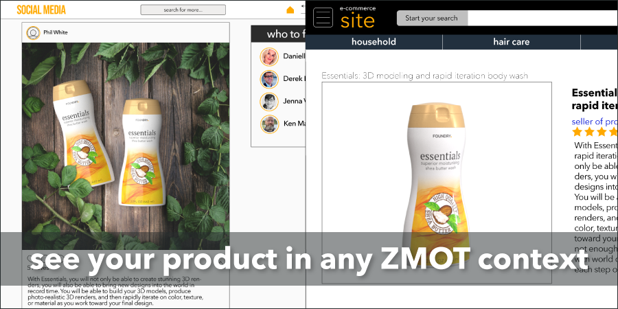
With these tools in hand, you will have confidence that your product will be notably superior the first time the consumer interacts with it.
Mastering the First Moment of Truth
|
What is the Science behind the FMOT?
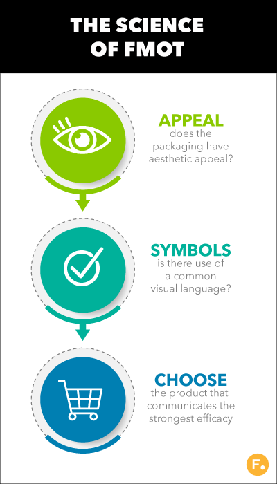 In today’s marketplace, most of your competitors are spending a similar amount of money on advertising as you are. You can’t turn on the TV or flip through Facebook without seeing an ad for your or one of your competitor’s products. An enormous amount of energy is spent on getting the consumer’s attention. So how do you gain notable superiority over your competitors?
Sundar, Noseworthy, and Machleit, researchers at the University of Cincinnati and Guelph think they have the answer. In a 2013 study they published, they started by noting that how well a product will work is a bit of a “black box” if a consumer has never used it before. Sure, consumers can read the list of active ingredients (in the case of home or personal care items), but most will have little idea if the ingredients listed translate to a powerful product.
So, the consumer will turn to the one thing they can judge — the packaging. To be fair to the consumer, packaging conveys a lot of information. Is the shape pleasing to the eye? In the case of home care products, does it convey value and efficacy? If it is beauty care, does it convey luxury and trust? All this can sway consumers in those crucial seconds when they first spot your product.
In fact, Sundar, Noseworthy, and Machleit go on to demonstrate that when price and brand recognition are the same (and the performance of the product unknown), the packaging with the most aesthetic appeal will most likely be selected. That’s right, the most attractive packaging to the shopper will decide which product is put in the shopping cart.
In a related study in 2011, Townsend, Montoya, and Calantone note that the strategic use of symbolic cues can help consumers associate your product with their desired outcome (i.e. a clean home, fresh air, or flawless skin). This “visual language” can communicate more than words alone. Couple this with the overall beauty of your packaging and you have a recipe for gaining notable superiority at the retailer’s store shelf.
How Can You Best Design for the FMOT?
Given this, you need to ensure that your packaging design stands head- and-shoulders above the competition. But how could you incorporate your competitive landscape (online or in-store) as you design your packaging?
Up till now, you really couldn’t. For most companies, testing their products against their competitors normally would come after a design had gone through rounds of physical prototyping and mock store shelves constructed for consumer studies. Only then could designers see how their packaging stacked up against the competition.
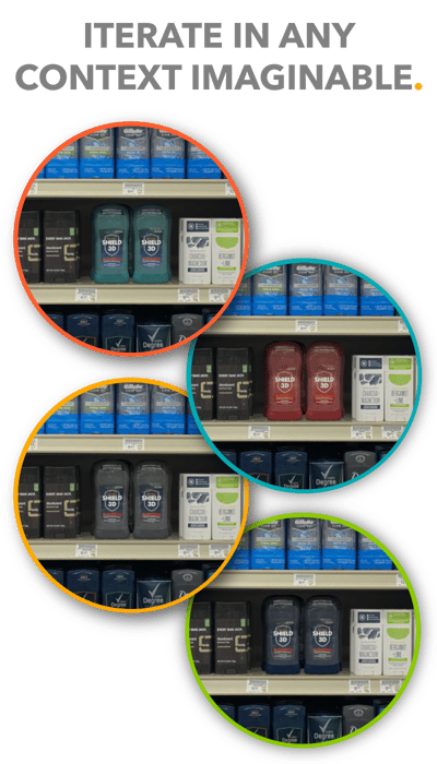 But what if, after all that, key findings were discovered that needed to be incorporated into the design? It meant starting over and repeating the process until you got it right. All this was expensive in both time and money.
What is needed is a way to rapidly iterate, in real-time, with virtual prototypes and use those same virtual products to conduct cpg market research in both online and virtual retail environments. In this way you can see how your packaging designs will interact with your competitors where it is needed most — in real-time and in-context. The good news: You can with Foundy’s products.
With Colorway and Modo, you can:
- Iterate on your designs with photo-realistic renders.
- Place virtual prototypes in any context imaginable (online or retailer’s shelf).
- Conduct consumer studies and incorporate feedback in real-time.
- Seamlessly work with 2D and 3D designers to find your final design, faster.
With Colorway and Modo, you can truly see what your final design will look like before it rolls off the production line. What’s more, once it comes off the line, you can be confident that it will be notably superior when it is placed on the shelf.
Mastering the Second Moment of Truth
|
What is the Science behind the SMOT?
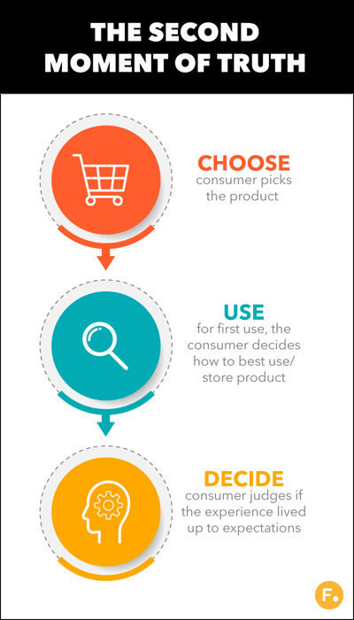
When thinking about the SMOT, it is important to not think about consumers buying a product, but buying the benefits that your product provides for them when they use it and how it makes them feel about themselves when owning/ using it. After all, that is how the consumer will ultimately form an opinion about your product.
But, before we continue looking at first use, we must remember that before they even use it, they have already begun to form opinions about the performance/desirability of your product based on what they can judge — the packaging.
From the moment the consumer first sees your product on the retailer’s shelf (or online), they start to form a value judgement on how it will meet their needs. They take in all available cues and clues embedded within the packaging and select the product that most closely matches their desired outcome, notes Martin Löfgren.
Once purchased, the consumer will again absorb the needed information from the packaging on how to best use your product. If they are able to successfully use your product to achieve their desired outcome, their first experience will have been a success and will, on the whole, help them form a favorable opinion.
Löfgren goes on to highlight the value of looking at the point of purchase and first use as a total customer experience in which a brand should orchestrate the clues and cues that are embedded within your packaging. If done correctly, it will guide the consumer to the best use and storage of the product and toward a favorable experience.
Crucial point: Imagine your packaging is a spokesperson for your brand, placed in the consumer’s home. They are there, 24/7, giving the consumer the correct visual cues and information they need to both use and store the product, making their user experience as easy and satisfying as possible.
How Can You Best Design for the SMOT?
 How, then, do you design your packaging to be notably superior in SMOT scenarios? A typical workflow will include these four steps:
- One: Identify the emotions you want the consumer to feel when they first use the product.
- Depending on what you are selling they could feel indulgent, satisfied, successful, capable, smart, trendy, etc.
- Two: Identify the benefit that your product will provide the consumer when they first use it (and every time afterward).
- Depending on your product it could be streak-free clean windows, flawless-looking skin, clean and conditioned hair, etc.
- Three: Determine what visual cues you will need to give the consumer in order for them to arrive at the emotional state and use outcome.
- What “visual language” will you need to deploy in order for them to successfully use your product and feel satisfied with their purchase?
- Four: Test your designs in actual SMOT scenarios and iterate on them to ensure your cues are received appropriately.
- In order to know if your proposed design will work, you must test it in real-world situations to ensure it performs well.
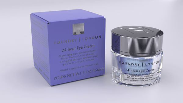 In order to flesh these steps out, let’s take, as an example, a fictional brand selling a 24-hour eye cream. Their motto is selling “affordable luxury” in that they offer high-end products at a mid- market price. So, their packaging must convey distinctive luxury while also being accessible and easy to use.
With this in mind, they are aiming for the consumer to feel elite and savvy when first using their product (and every time afterward). In order to achieve this emotional target, they have decided on these visual cues:
- Molded glass jar: Highly reflective, eye-catching, and more luxuriant than their competitors’ plastic containers.
- Color of cream: Distinctive iridescent purple that is superior to the typical nude color of their competitors’ products.
- Lid: Their lid will need to be plastic (to keep in the price-point) but will be a highly reflective pewter color that will stand out among the more typical gold or chrome-colored lids of competitors’ products.
- Instructions: Affixed on the bottom of the jar with white label and are clear and legible.
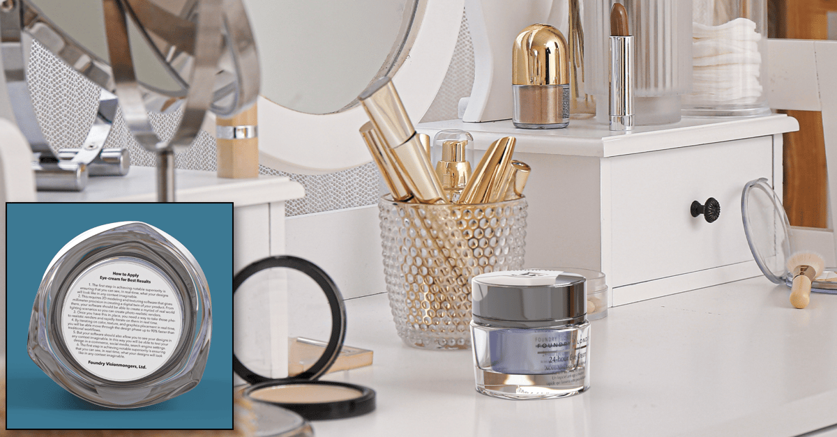
Here is the results of their packaging test, placed in a typical SMOT scenario: As you can see, the packaging with it’s visual cues, hits the mark on all counts:
- The pewter-colored lid is distinctive and is more luxuriant than regular chrome or gold finishes on plastic lids.
- The glass catches the eye with the base especially playing with the light.
- The color of the cream plays with the light and adds a rich, visual texture.
- Finally, the instructions label is easily seen.
The best news: Instead of this being a time intensive physical prototype, it’s a virtual sample placed in a virtual environment. It was produced in a fraction of the time it takes to create a physical prototype. On top of that, the design team can rapidly iterate on design so that dozens of virtual samples can be created in a matter of minutes for the needed stakeholders to review.
With typical design workflows, most packaging designs take multiple rounds of iteration. Producing physical prototypes of each iterations and placing them in real-world scenarios to judge performance is impractical at best.
- Now with Foundry’s Colorway and Modo, you can:
- Iterate on your designs with photo-realistic renders.
- Place virtual prototypes in any context imaginable.
- Conduct consumer studies and incorporate feedback in real-time.
- Seamlessly work with 2D and 3D designers to find your final design, faster.
With Colorway and Modo, you can truly see what your final design will look like before it rolls off the production line. What’s more, once it comes off the line, you can be confident that it will be notably superior when it is placed on the shelf, helping aid you and your organization in the share gains you are striving towards.
Mastering the Ultimate Moment of Truth
|
What is the Science behind the UMOT?
Everyone loves chocolate. Since brands know this, there are a lot of chocolate bars vying for market share. So standing out on the store shelf can be difficult. What’s even more difficult with the wide selection available? Getting first time consumers to become repeat customers. So Shekhar and Raveendran, professors at VIT and Kannur University, set out to understand the correlation of the packaging of chocolate to how it relates to the FMOT and SMOT.
Their findings? They found that the chocolate wrapper indeed had an effect on the FMOT. The more colorful and eye-catching, the better it performed. But not so with the SMOT. Once the chocolate was consumed, the wrapper had little bearing on whether the shopper would continue to buy it. It just came down to taste.
But before we assume that there is no link between the FMOT and SMOT, let’s have Martin Löfgren weigh in. In his paper, co-written with Witell and Gustafssonm, they note a correlation between the role packaging plays between the FMOT and SMOT — namely setting and delivering on expectations. Löfgren writes, “the customers’ experience of the first moment of truth affects how the second moment of truth is experienced.” In other words, the consumer will develop a set of expectations of the product’s performance based on what the packaging communicated.
The second moment of truth will, in large part, be dictated by how well the CPG product lived up to those expectations. So, in the case of the chocolates, the packaging likely influenced the SMOT if it set expectations properly. (After all, if the package said “milk-chocolate and caramel” but wrapped a “dark-chocolate and chili pepper” bar; you’d be setting folks up for a surprising but most-likely unhappy experience.)
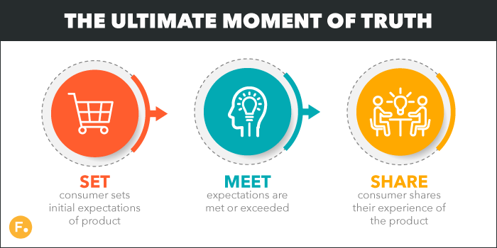
What, then, does this mean for the UMOT? Simply put, if the consumer’s expectations were met or exceeded in the SMOT, then the likelihood of them sharing their favorable experience increases. This means that you must fully understand how your packaging’s visual cues and clues will be perceived in the FMOT and SMOT so that you can guide the consumer to maximum enjoyment of using or consuming your product. In this way, your packaging is not just an “always-on” salesperson on the store shelf, but an “always-on” concierge of the user experience.
How Can You Best Design for the UMOT?
 So, how do you make sure your packaging designs will act as the user experience concierge that will have consumers raving about their new “favorite product” online? Here are three things that you must keep in mind when designing for the UMOT:
- How well are your packaging’s visual clues and cues seen in FMOT scenarios?
- How well are your packaging’s visual clues and cues seen in SMOT conditions?
- How well are your packaging’s visual clues and cues seen when shared online?
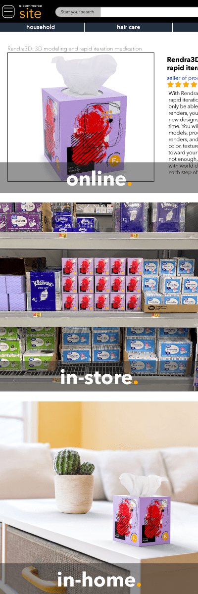
Take, as an example, this tissue company that is trying to enhance their standing with consumers aged 25-35. They want to make a splash in the market with more fashion-forward trendy designs for their packaging. They realize that in order for this demographic to share their experiences with their brand, they need to produce tissue-box designs that will enhance the home decor of this emerging demographic.
As you can see, they placed their packaging in a variety of contexts to see how their designs actually looked. Note:
- The tissue box’s design is well-seen, even on an e-commerce site.
- The packaging stands out on the store shelf (against its competitors)
- The design gives a lively pop of color in the home that the current 25-35 age demographic finds appealing.
But, in order for these considerations to be fully addressed, you can’t waste time with physical prototypes. The amount of time it would take to produce just one physical prototype and then place it in each context is impractical at best. What’s worse is that the typical design workflow requires multiple rounds of iteration. What is needed are virtual prototypes that can be rapidly iterated on in any context imaginable.
The good news, now with Foundry’s Colorway and Modo, you can:
- Iterate on your designs with photo-realistic renders.
- Place virtual prototypes in any context imaginable.
- Conduct consumer studies and incorporate feedback in real-time.
- Seamlessly work with 2D and 3D designers to find your final design, faster.
With Colorway and Modo, you can truly see what your final design will look like before it rolls off the production line. What’s more, once it comes off the line, you can be confident that not only will it be notably superior on the store shelf (or online), it will perform as your brand's experience concierge and lead to rave reviews.
ROI Calculator for Digital Packaging Creation
 The most important way of creating a resilient packaging design workflow is through digital transformation. In fact, a recent survey conducted by ZDNet and Tech Republic found that even in the midst of the COVID global pandemic, 44% of businesses planned on increasing their IT budgets. Why? As companies reset to a “new normal” of a distributed workforce and increased supply chain shocks, digital transformation is the most reliable way to bolster communication, aid collaboration, and speed time to market.
For design teams, digital transformation means moving from more traditional workflows to a truly integrated digital package creation. But how do you know embarking on a journey like this will be worth it for your company? Below is a simple guide to help you calculate the possible ROI that digital transformation can bring. But before we dive in, let’s look at what digital packaging creation is and the goals associated with it.
What is the Goal of Digital Package Creation
Digital Package Creation: Designing (or redesigning) packaging for consumer packaged goods using software that allows for photo-realistic 3D rendering of the design, rapid iteration via virtual prototypes, and real-time updating of design during consumer research.
The goal of converting to digital package creation over more traditional methods is to speed time to market, uncover market insights, and yield a notably superior product over your competitors. But, Michael Gale, former partner at ICF Next, points out that of all the companies embarking on a digital transformation, only “one in eight got it right” and within those seven-out-of-eight companies, failure ranged from minor to complete failure. So, it’s best to have a clear goal, measurable steps to get there, and expert guidance to help guide along the way.
That said, any digital package creation project, then, should have these goals:
- Speed overall time-to-market (push market insights to consumers faster)
- Develop seamless communication (unite a more a distributed workforce)
- Reduce physical prototype waste (create more sustainable workflows)
- Reduce design times (increase the value of your designers time)
- Develop 3D competency among in-house workforce (reduce outsourcing costs)
Each of these goals should have identified metrics attached to each goal, specific to each company. With these goals in mind, it’s now time to see the benefit of conducting a digital package creation transformation.
Cost of Doing Business: Current Workflow
First, we will want to quantify the cost of doing business with our current workflows. Below is a sample set of an itemized list of costs for designing a single new brand.
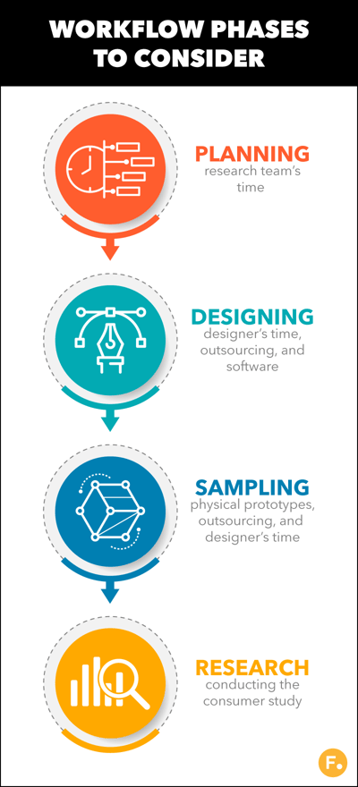 Planning Phase
- Research team’s time (number of personnel x average hours for one person x average hourly salary)
Design Phase
- Designers time (total hours x average hourly salary)
- Outsourcing of design work (when applicable)
- Virtual modeling of packaging
- Outsourcing 3D modeling (when applicable)
- Outsourcing 3D rendering (when applicable)
- Cost of software (current CAD, 3D modeling solution)
Sampling Phase
- Physical prototypes produced/manufactured
- Designers review time (total hours x average hourly salary)
- Outsourcing of design work to incorporate review insights (when applicable)
Research Phase
- Consumer study set up (physical or virtual environment)
- Outsourcing of consumer study design (when applicable)
- Conducting the consumer research
- Outsourcing of consumer research (when applicable)
- Synthesizing the results
While the list is not exhaustive, it should help you to understand the cost of one design cycle for a single product. Now, let’s look at the costs associated with a single design cycle with digital product creation fully implemented.
Cost of Doing Business: DPC
Let’s be clear, fully implementing DPC into your packaging design workflow is an iterative process. It is not done overnight. The example below shows what a DPC workflow might be like once it is fully implemented.
Planning Phase
- Research team’s time (number of personnel x average hours for one person x average hourly salary)
Design Phase
- Designers time (total hours x average hourly salary)
- Virtual modeling of packaging
- Cost of software (3D modeling and rapid iteration solution)
Sampling Phase
- Designers review time (total hours x average hourly salary)
Research Phase
- Consumer study set up (virtual environment)
- Conducting the consumer research
- Synthesizing the results
Now that we have the traditional workflow and fully DPC costs laid out, let’s fill these numbers in for a side-by-side comparison.
Example ROI Calculator
Finally, let’s plug in some example numbers of a typical package design with a traditional workflow and one where DPC has been fully implemented:
|
Items |
Traditional Workflow |
DPC |
|
Planning Phase |
||
|
Research team’s time (5 people @ $40 p/hr) |
for 20 hours: $4,000 |
for 10 hours: $2,000 |
|
Design Phase |
||
|
Designer’s time |
1 PM @ $40 p/hr x 20 hours: $800 |
2 designers @ $40 p/hr x 20 hours: $1,600 |
|
Outsourcing of design work |
$5,000 |
N/A |
|
Virtual modeling of packaging |
$1,600 |
N/A |
|
Outsourcing 3D modeling |
included |
N/A |
|
Outsourcing 3D rendering |
included |
N/A |
|
Cost of 3D software |
$5,080 |
$9,000 |
|
Sampling Phase |
||
|
Physical prototypes produced/manufactured |
$5,000 |
N/A |
|
Designer’s review time |
1 PM @ $40 p/hr x 20 hours: $800 |
1 designer @ $40 p/hr x 10 hours: $400 |
|
Outsourcing of design work to incorporate review insights |
$1,000 |
N/A |
|
Research Phase |
||
|
Consumer study set up |
1 PM @ $40 p/hr x 20 hours: $800 |
1 designer @ $40 p/hr x 10 hours: $400 |
|
Outsourcing of consumer study design |
$5,000 |
N/A |
|
Conducting the consumer research |
2 designers @ $40 p/hr x 10 hours: $800 |
2 designers @ $40 p/hr x 10 hours: $800 |
|
Outsourcing of consumer research |
$5,000 |
N/A |
|
Synthesizing the result |
2 designers @ $40 p/hr x 5 hours: $400 |
2 designers @ $40 p/hr x 5 hours: $400 |
|
TOTAL COSTS |
$35,280 |
$14,600 |
With a 59% savings on cost for a single packaging design, we can already see that long-term the company will see significant savings. But we have one final question to answer: Will the cost to retrain or hire new employees still make a DPC transformation worthwhile? Here is a quick way to figure that out:
Let’s say the 2 designers in the example above spend time attending a 3-day intensive (6 hours each day) to learn the new 3D modeling and rapid virtual prototyping software. On top of that, there is a cost of learning the new software (where they are still familiarizing themselves with it) (4 hours each). Finally, there is also time taken in installing and configuring the new software (5 hours each). Here it is itemized:
|
Item |
Cost |
|
Installation of software (2 designers @ $40 p/hr x 5 hours) |
$400 |
|
Training (2 designers @ $40 p/hr x 18 hours) |
$1,440 |
|
Learning curve (2 designers @ $40 p/hr x 4 hours) |
$320 |
|
Cost of new software |
(already factored into the cost analysis) |
|
TOTAL COST OF ACQUISITION |
$2,160 |
With this in hand, we can calculate ROI this way:
ROI = Benefit of Transformation / Cost of Transformation x 100
ROI = $20,680 / $2,160 x 100
ROI = 957%
All in all, an amazing return on investment!

